1 October 2024

How a Simple Snail Became the Heart of Loam Bistro’s Brand Identity

The Visual Journey Behind Loam’s Slow Food Ethos

When Manya and Masoom approached Yashita Aggarwal and her design team to create Loam’s brand identity, they sought a reflection of their passion for slow food and artisanal cheesemaking. Drawing inspiration from the snail, a symbol of patience, earthiness, and the deliberate process behind their work, Yashita and her team developed the Loam Snail—a geometric, sophisticated emblem that became the foundation of Loam’s visual identity.

The team crafted a logotype that struck a balance between elegance and approachability. The subtle contrasts between the thin and thick strokes conveyed refinement, while the rounded shapes added a sense of warmth. This interplay of elements captured Loam’s blend of high-quality craftsmanship and welcoming atmosphere.

To complement the visual identity, Yashita’s team selected a color palette of burnt reds, browns, and beige, evoking an earthy yet classy aesthetic that resonated perfectly with the café’s essence.

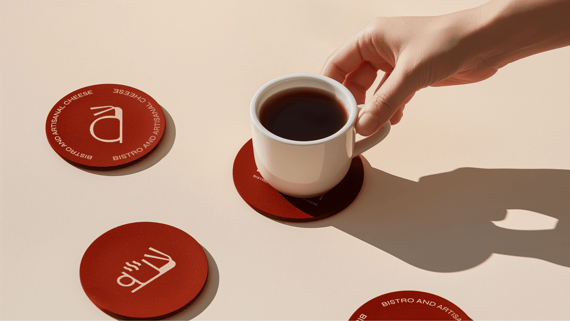
Building on the snail emblem, the team designed a dynamic icon system where elements such as coffee cups, bread, and cheese were rendered in a geometric style, ensuring visual cohesion across all brand applications. For typography, they chose SYNE, a geometric sans-serif, paired with Ivy Presto, a serif font, to introduce a fusion of modern simplicity and timeless sophistication.

This identity was then applied thoughtfully across various touchpoints, from packaging to menus and signage, resulting in a cohesive brand experience. Ultimately, Loam became a space where patience and quality come together to invite customers to savor life’s simple pleasures.

Creative Director - Yashita Aggarwal
Design Team - Ayush Naresh Kumar, Subhan Mughal, Nubaer Hossain
Image Courtesy Yashita Aggarwal

Creative Director - Yashita Aggarwal
Design Team - Ayush Naresh Kumar, Subhan Mughal, Nubaer Hossain
Image Courtesy Yashita Aggarwal

Want to get featured?

We love to see new design projects from South Asian Designers, and we check every submission we get.